Contents
Introduction
The goal of this project is to identify which areas in the contiguous United States are most likely to be secretly home to a proportionately large psychic population. The method I am using requires that I make a few assumptions:
- That FM radio waves have an appreciable effect on cognition in psychics (recent studies have indicated that FM radio waves may interfere with brain waves, but not to any physical consequence - Psychics are assumed to be different);
- That the interference caused by FM waves to psychic brain waves results in a measurable decrement to cognitive ability;
- That a good measurement of the decrement to cognitive ability, spatially, is local college and university statistics (public school performance statistics will be affected too heavily by other local factors).
In order to measure any effect radio waves have on cognitive ability spatially, I will find those areas where there is the strongest negative correlation between:
- The measured performance in colleges/universities, and
- The number of FM signals in range of that college/university
This analysis will result in a map of the US symbolizing the spots most likely to be home to psychics according to the above methodology. The next step will be to compare this to an aggregate map of the conventional ley lines and vortexes, or other superstitious energies.
I will need the following data for this project:
- FM radio stations (source: FCC)
- Colleges and Universities (source: HIFLD)
- College/university performance statistics (source: IPEDS)
- Ley lines (source: blogs linked to below.)
- Vortexes (source: Google)
Initial Setup
I made a "Project" folder in my removable drive, within which I made a "Data" folder to save intermediate data and my file geodatabase into, and a "Maps" folder to hold my ArcMap project. I also made a "Reporting" folder to hold screenshots, notes, and eventually my PowerPoint presentations. I will write this guide assuming the same setup.
Collecting Data
FM Radio
- Go to https://www.fcc.gov/media/radio/fm-query to get all FM stations in the US.
- Under "Output -- Select FM Query or FM List" choose "FM List".
Unfortunately, this data is not delimited by tabs or given a way to easily download it, so we'll have to turn it into something we can work with. There were 26829 entries when I did this. Another problem was that the location data was given in a string format, with the compass direction, degrees, minutes, and seconds separated by spaces. We don't want to go to the trouble of finding a geocoder that can parse that.
- Copy the entire list of data from the page into a fmraw.txt file. Make sure the headings are removed from this file so that it contains row data only.
- To tab-delimit the raw data, I wrote a little Java program and ran it on the fmraw.txt, into a new fmtab.txt file. This program had to recognize when data was missing and put in the extra tab for it, so that everything will be in place.
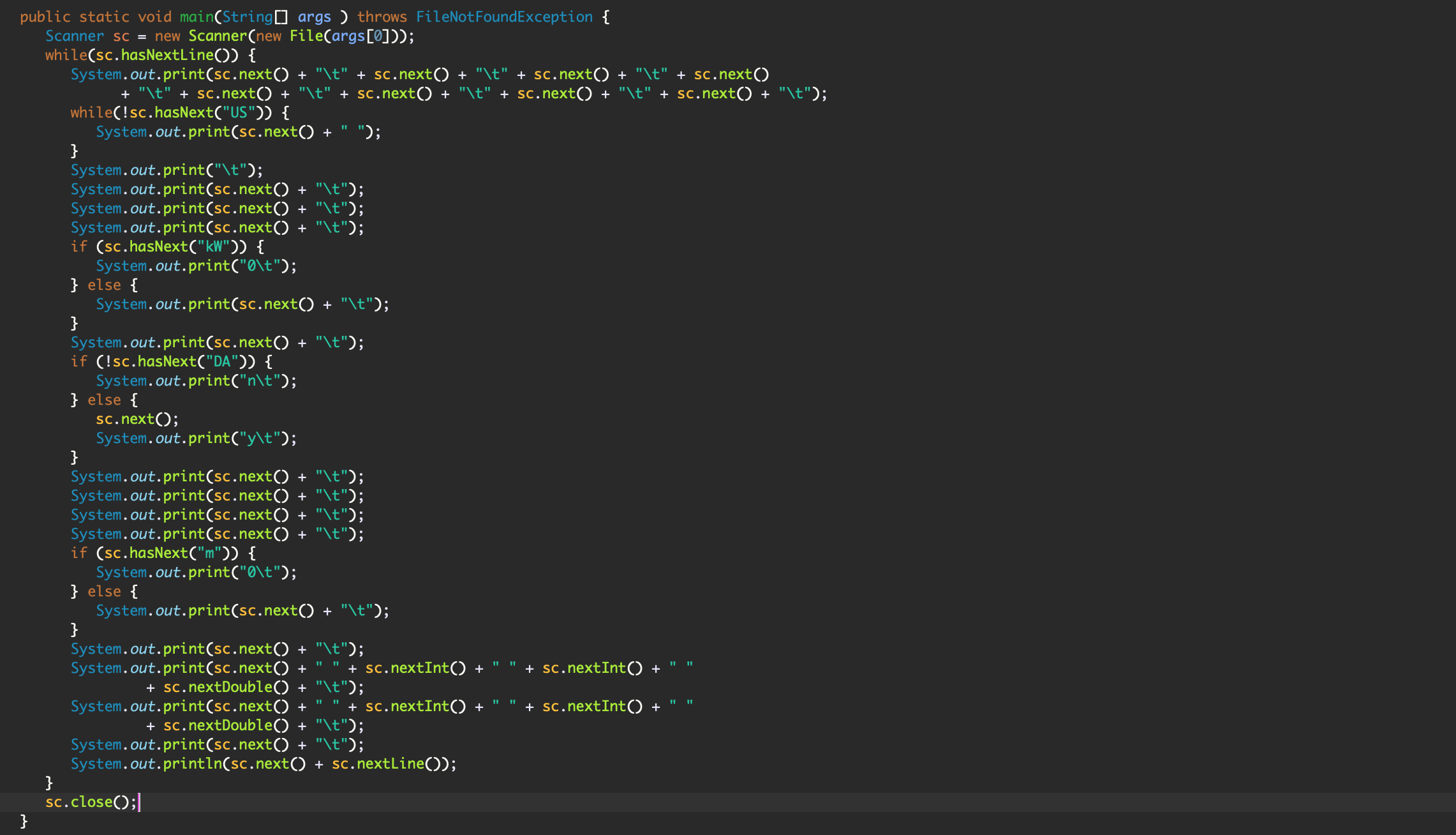
Figure 1: CustomDelimiter.java
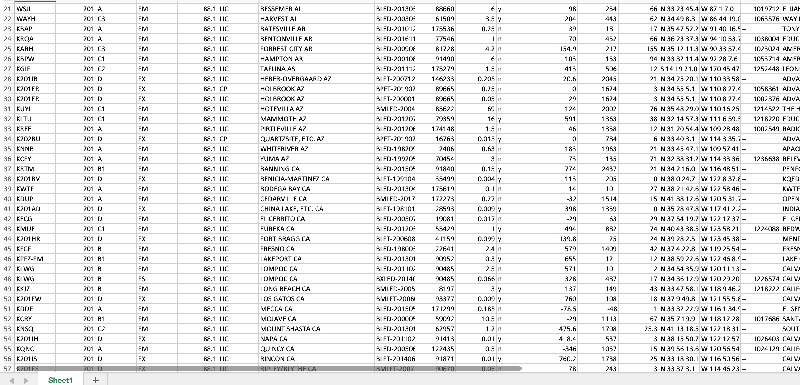
Figure 2: Tab-delimited FM radio data in Excel
- Open the new tab-delimited txt file in Excel.
- Highlight the whole Latitude column and use Excel's Text to Columns tool. Turn the Latitude column into 4 columns, one each for compass direction, degrees, minutes, and seconds.
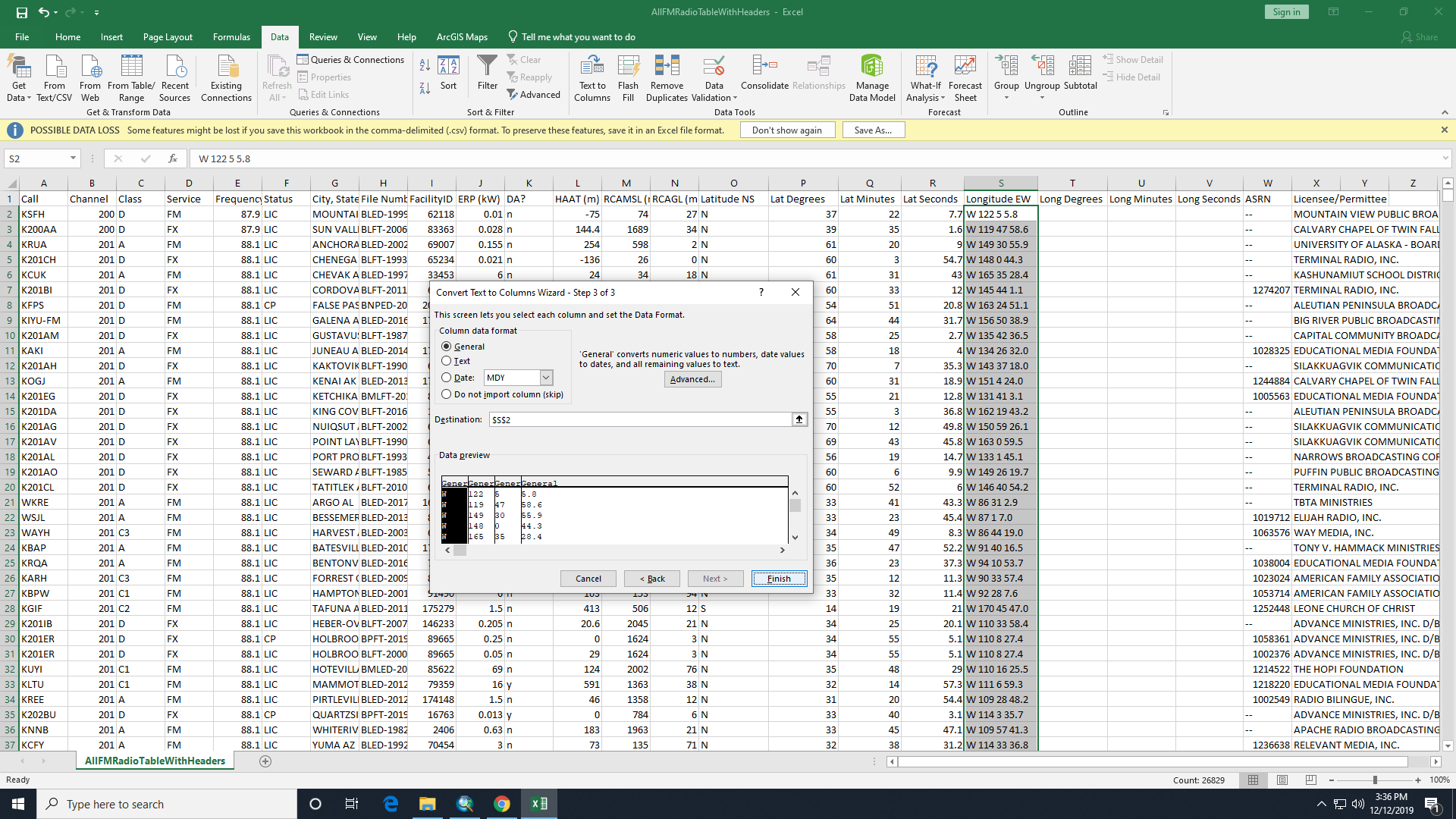
Figure 3: Use of the Text to Column tool
- Do the same for the Longitude column. Make sure your Latitude degrees column is named differently from your Longitude degrees column, and so on.
- Still in Excel, make sure each of the new columns is formatted as a number if it is a number, and make sure the seconds columns retain their fractional part (keep the decimal places). This can all be done by highlighting and right-clicking the columns and clicking Format Cells.
- Save the table as tab-delimited csv into the Data folder.
Now when we import this table into ArcGIS we can use these new columns to calculate the latitude and longitude as decimal degrees. Then we will be able to geocode the radio stations.
Colleges and Universities
- Colleges and Universities
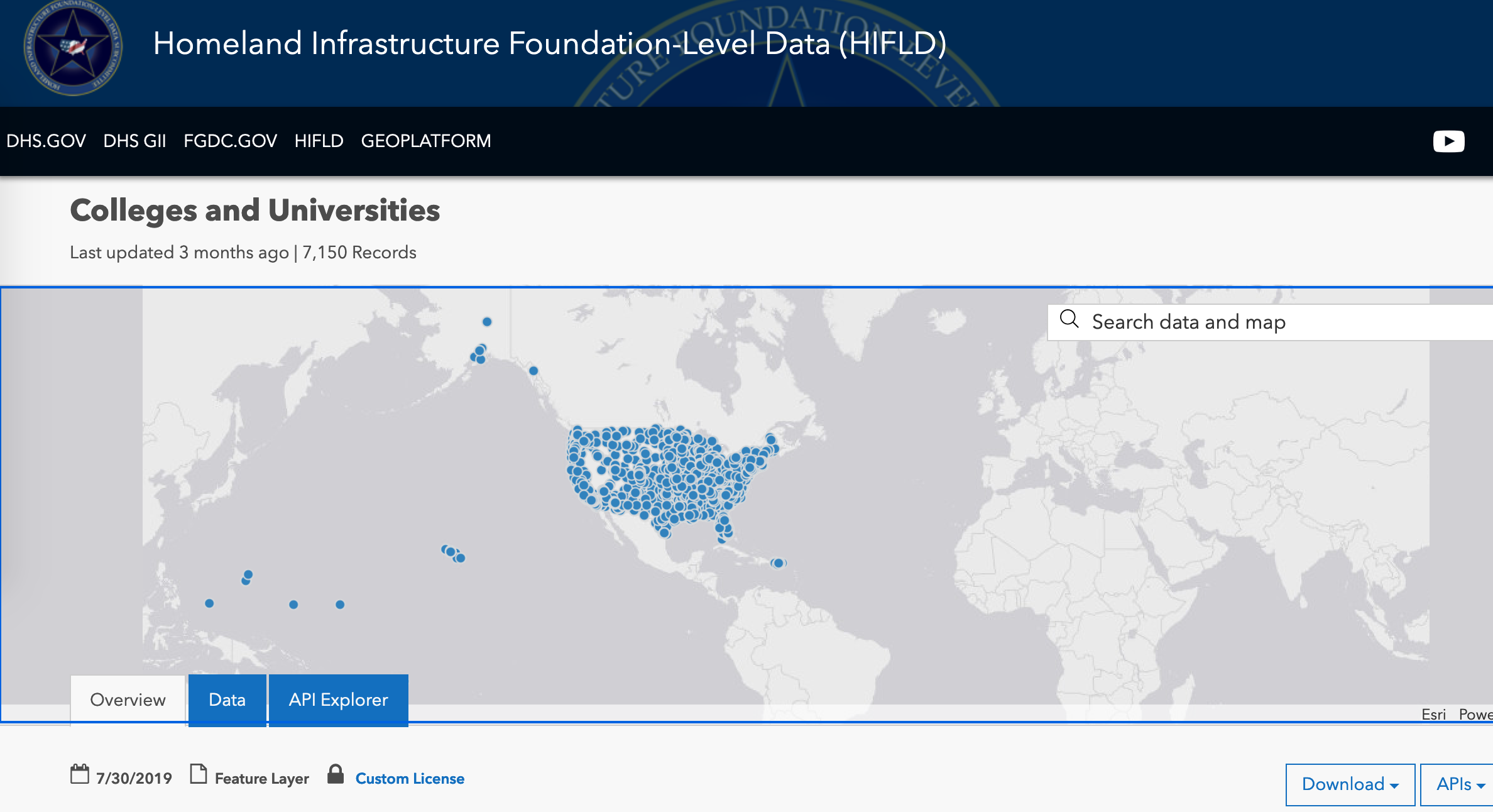
Figure 4: The HIFLD Colleges and Universities data
- Click "Shapefile" in the Download drop-down to download a point shapefile of 7150 colleges/universities.
This shapefile is thorough and contains the locations of every college/university in the US, but doesn't contain any data that we could use to measure academic success or cognitive ability. So we'll get a table that does have that information but doesn't have location.
- Go to the IPEDS website at https://nces.ed.gov/ipeds/use-the-data
- Click Summary Tables.
- Choose "By Groups -> EZ Group" and check "U.S. only" to select all US institutions.
- Hit Search, then Continue to Step 2 - Select Templates.
- Under Graduation Rates, click "Graduation rates (150% of normal time) and transfer-out rates"
- Now you can hit the button to download the data for Excel.
This table will also need some grooming before it is ready to bring into the project. Both of our colleges/universities data have an IPEDS ID, which is what we'll use to join them, but we need the columns to be of the same type. As well, the % signs in the percentage fields will cause those columns to be imported as text, so that needs to be fixed.
- Open the IPEDS data in something like Notepad or TextEdit, and use the "Find and Replace All" tool to get rid of all the percentage signs. Save it.
- Open the data in Excel to choose the correct formatting for each column. IPEDS ID must be text, and the rate fields must be numerical (double).
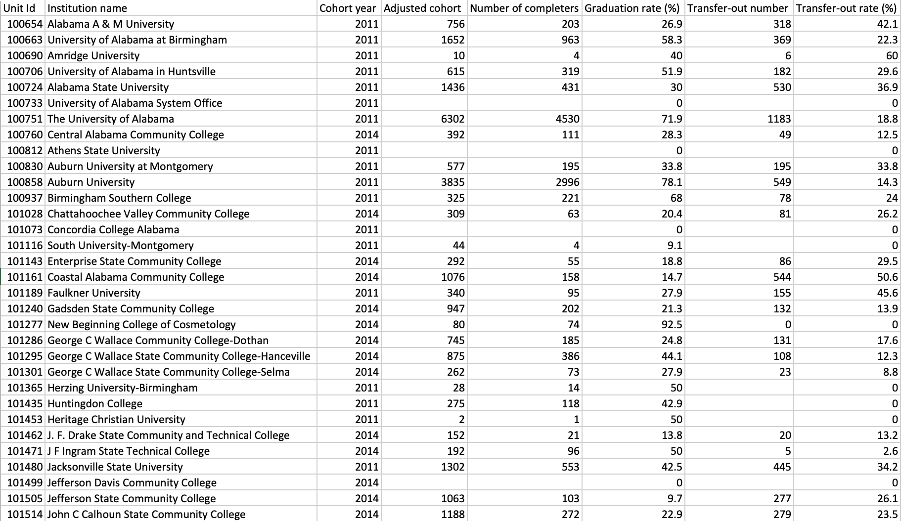
Figure 5: Correctly groomed IPEDS data
Vortexes (Vortices?)
A vortex is apparently a word for a site of high spiritual energy, or where the Earth's energy rises up like a vortex. It's not a well-defined convention, but a convention nonetheless. There is a map of "known vortexes" (I will refrain from using quotation marks from here on, as it would get exhausting) at www.vortexhunters.com/vortex-map.html which I almost used, but I realized that it would skew my analysis; These are reported vortexes, and so naturally they occur most in areas of high population. I don't want that skew in my final comparison. This seems to be the most complete list of vortexes, and relies on report, so I opted instead to focus on a smaller number of famous vortexes, such as at Sedona, and consider them to represent very substantial concentrations of superstitious energy.
- Open Google and search "vortex sites in USA". As of now, this returns a list of eight especially prominent vortexes. These are the ones we will consider for our analysis.

Figure 6: Google search for prominent US vortexes
- Click the first one, Cathedral Rock.
- Open Google Maps from the right of the page to display the location of Cathedral Rock.
- Right-click that location and select "What's here?"" to get the coordinates of the site, which will be displayed below. (34.820036, -111.793199; or thereabouts depending where exactly you right-clicked).
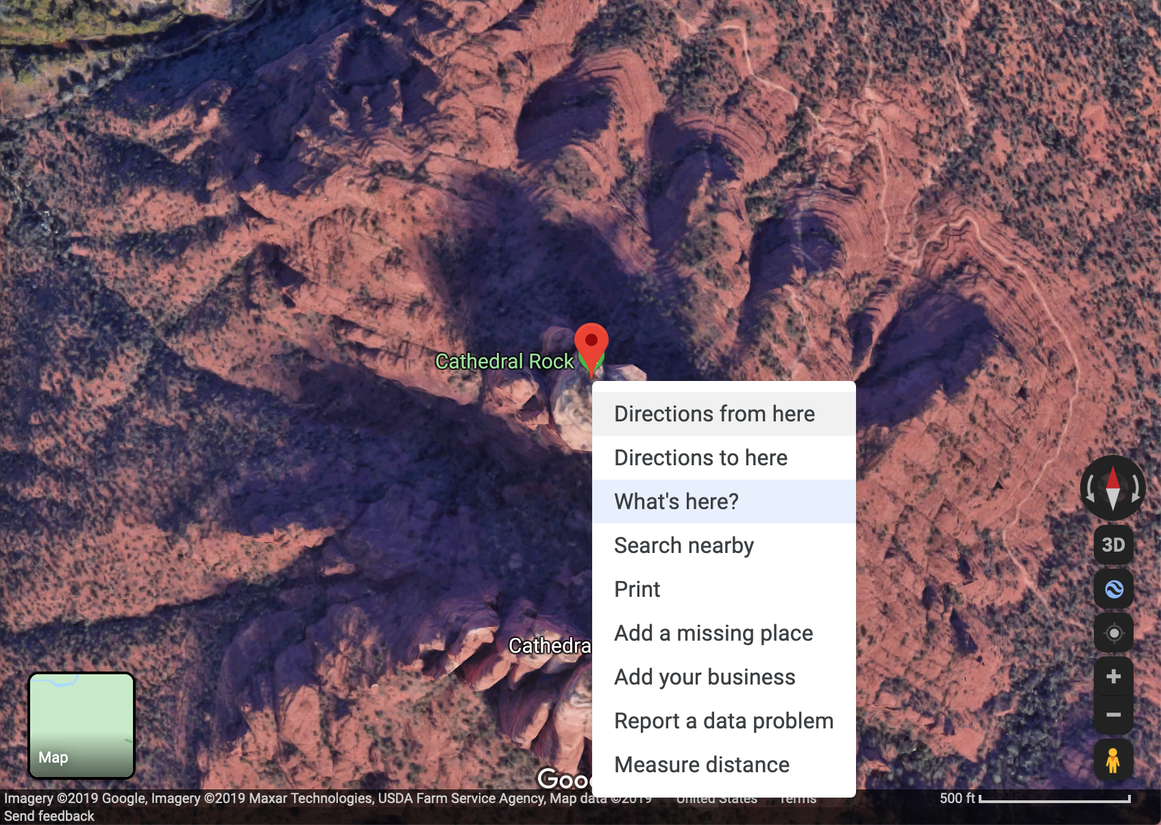
Figure 7: Getting vortex coordinates
- Open a new .txt file to store this information. We will make a vortex feature dataset from scratch.
- Make the first line for the field names, delimiting each with a tab. I made a field for ID (count from 1), Name, Latitude, Longitude, SiteType (all vortex but allows for expansion later).
- Fill in a row for Cathedral Rock.
- Repeat these steps for the other seven vortex sites.
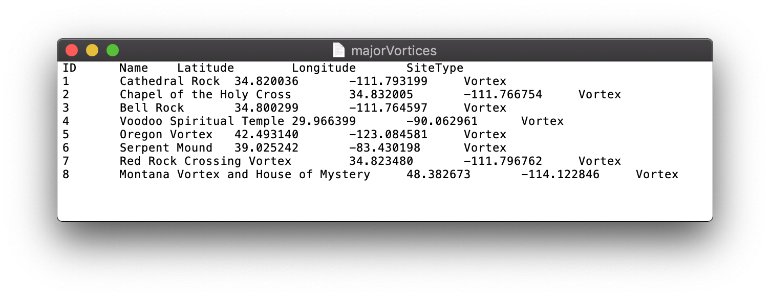
Figure 8: Vortexes data filled in from scratch
- Save the txt file.
Ley Lines
Another convention of spirituality or superstition is that of ley lines. It is an old concept; The idea is that there are invisible lines across the surface of the Earth that represent the flow of energies (or magnetism, depends on who you ask). Part of the concept is that these lines naturally cross through areas of power or spirituality. The intersections of these lines are especially powerful, (and as such I will stack their energies in my aggregate energy layer). These intersections, or "nodes" are also often vortex sites. I would think, given the number of purported areas of energy, it would be trivial to draw lines that intersect them. Yet, there at least seems to be almost a consensus as to where these lines are located over the US. One of the mappings of the lines has turned up more than once.
- Save the image at https://d.wattpad.com/story_parts/769842138/images/15b945595b01f322956611362928.jpg to the Data folder.
- Save the image at https://www.galacticfacets.com/uploads/9/4/8/8/9488982/published/mm-us-map.jpg?1519073823 to the Data folder. These two images have a mapping of the ley lines in common.
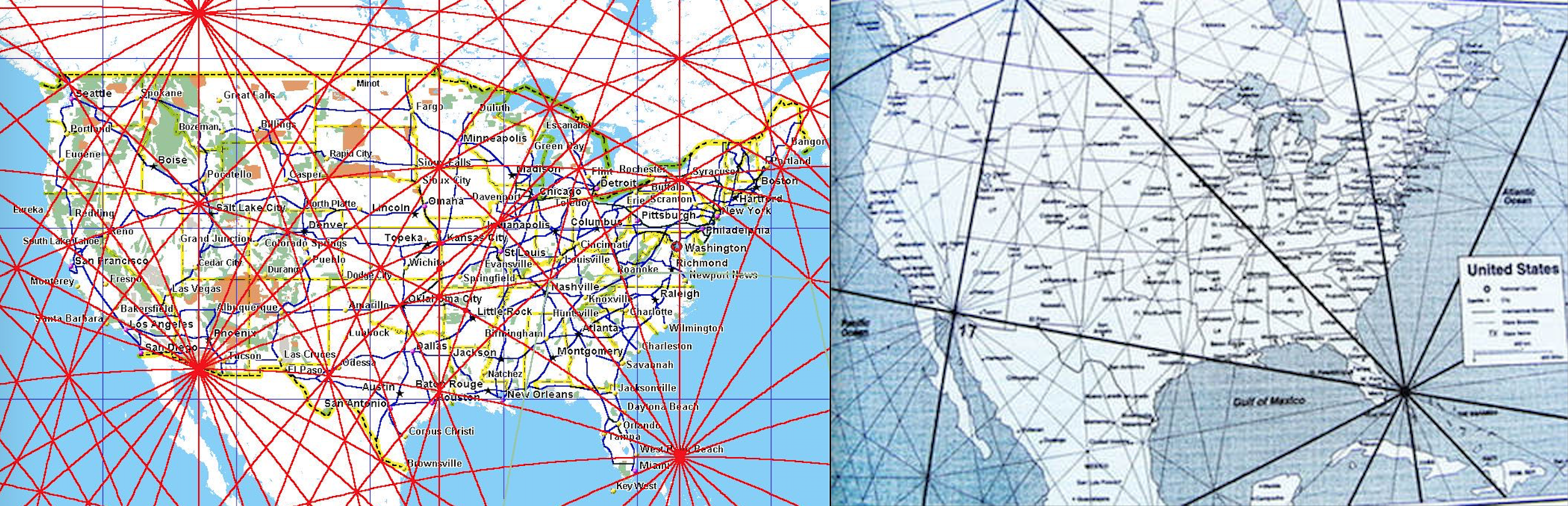
Figure 9: Examples of the ley line convention chosen
- This step may be different depending on what software is available to you. I opened these images in my default software for their file types, and exported them each as .TIFF files. Many image-editing programs can do this.
Assemble Data
- Open ArcCatalog, and connect to the Project folder.
- Create a File Geodatabase in the Data folder.
- Import the FM radio data as a table, making sure the ERP, HAAT, Lat Degrees, Lat Minutes, Lat Seconds, Long Degrees, Long Minutes, Long Seconds are all numerical.
- Import the HIFLD Colleges and Universities shapefile.
- Import the IPEDS table, making sure the IPEDS ID is text, and the Percentage fields are numerical.
- Import the vortexes table, making sure the Lat and Long are still numerical
- Start ArcMap and create a new ArcMap project in the Maps folder.
- Set the geodatabase you created as the default geodatabase in the Map Document Properties.
- Also in Map Document Properties, check "Store relative pathnames".
- Connect to the Project folder and the geodatabase.
- Drag the colleges/universities shapefile, the IPEDS table, the FM table and the vortexes table into the map.
Analysis
FM Radio Stations
We want to turn the FM Radio table into a shapefile that shows us the range of each station. First we need to turn each row into a point feature. We must geocode the table using decimal degrees.
- Open the attribute table for the FM radio stations. Create a new field called Latitude and format it to contain a decimal number with 8 decimal digits.
- Calculate the field. In the Calculate Field window enter [Lat_degrees] + ( [Lat_minutes] / 60 ) + ( [Lat_seconds] / 3600 ). As always, substitute variable names with your own if yours are different. Hit OK.
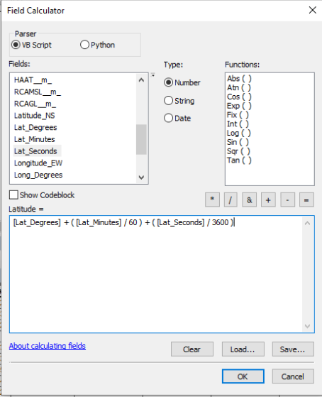
Figure 10: Latitude Field Calculation
- Now use Select By Attributes to select all of the rows where the compass direction is S - that is all of the rows where the original Latitude field began with S.
- Calculate your new Latitude field again, with the South stations selected. Calculate as: Latitude = [Latitude] * -1.0. (This translates the Latitude to a pure number, using negative to indicate South of the equator).
- Create a new Longitude field and perform the same calculations, making the all the West longitudes negative.
Now we can geocode the FM station data, because we have the coordinates in a form that the geocoder can understand. We're going to make a new point shapefile in the geodatabase.
- Right-click the FM radio table, and select "Display X Y Data" to geocode the rows.
- In the window that appears, make sure your newly calculated decimal degrees longitude field is set as the X, and your latitude field as the Y.
The FCC provides very little in the way of metadata for this dataset. The coordinate system is not provided. However, a standard for such data as this that covers the entire USA is NAD 1983. I tries this as the geographic coordinate system when geocoding, and it matched up nicely with the rest of my data across the whole USA, so it seems to be the right choice. For this map, we will use the USA Contiguous Albers Equal Area Conic USGS projection.
- Select NAD 1983 as the geographic coordinate system of the data, and project it to Contiguous USA Albers Equal Area Conic USGS, the projection we will use for this map.
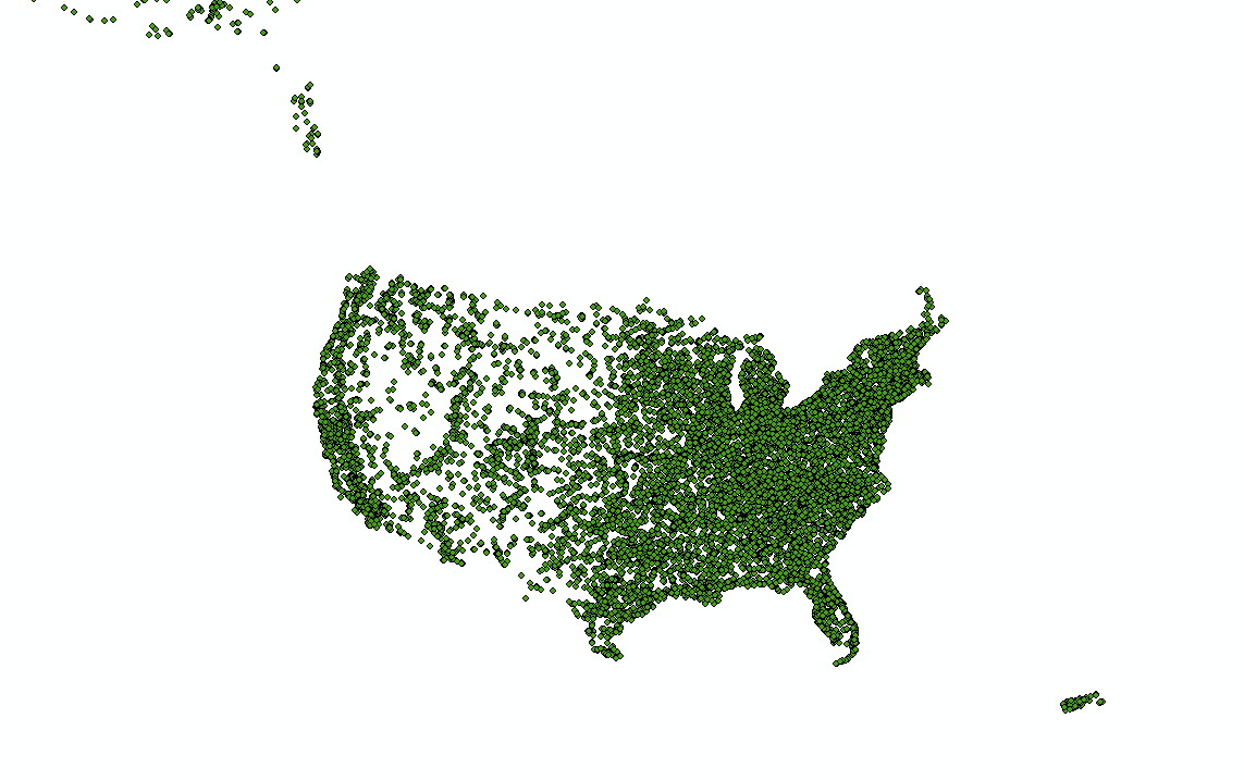
Figure 11: All US FM radio stations
- Now we have a layer called "<whatever the table was named>_events". Let's export it to our geodatabase so we have it saved and can remove the table from our contents pane.
- Right-click the new layer in the contents pane, and select Data, then export it to a new feature in the geodatabase.
Another thing the FCC does not provide is the algorithm they use for calculating signal reach from a radio station at a given dBu (decibel unit). The standard dBu at which it can still be considered commercial grade signal strength is 60. There is a tool on the FCC site that gives the reach radius from any FM station, but it would be enormously slow to put each one through that page, since we have thousands of stations. Instead I attempted to reverse engineer the algorithm on the page. Given a station's antenna height above average terrain (HAAT) in meters, and effective radiated power (ERP) in kiloWatts, and some target strength in dBu, it is possible to find a radius of reach. My quick look through some old documents leads me to suspect that the FCC doesn't use a pure math algorithm, but instead a reference table, along with interpolation for in-between values. My attempt at spoofing their algorithm lead to:
This is not a total analog but is a close enough approximation, and is at least proportionate. Let's remember we're here for the GIS. Before we start calculating for every station however, notice that some have faulty data, or data that indicates the station is not actually in use (or otherwise cannot produce a signal). This includes any rows with an ERP or HAAT that is 0 or below, or null. ERP >= 0 means that no signal is generated. HAAT >= 0 means the signal cannot appreciably propagate.
- Select By Attributes the FM radio features, to select those with [HAAT] > 0 AND [ERP] > 0. This is all the stations that are valid for our analysis (most of them)
- Invert Select. This is all stations with unusable data (a few of them).
- Delete the selected rows.
- Create a new field in the FM radio attribute table, for reach radius. (I called it WonkyReach, referring to my weak attempt at an algorithm).
- Calculate the field as described above. I switched to Python input and used math.pow( !ERP! , .394) * math.pow( !HAAT! , .444)
- Now we have a radius field in km for each station. Calculate again: Reach = ([Reach] * 1000.0) to get the radius in meters. This makes buffer calculation easier.
- Open the Buffer tool, in Analysis Tools -> Proximity -> Buffer.
- Use the FM radio points as the input, and for buffer width use the field we just created. Make sure it is using meters. Save this to a new file in the geodatabase, such as FM_Radio_Buffers.
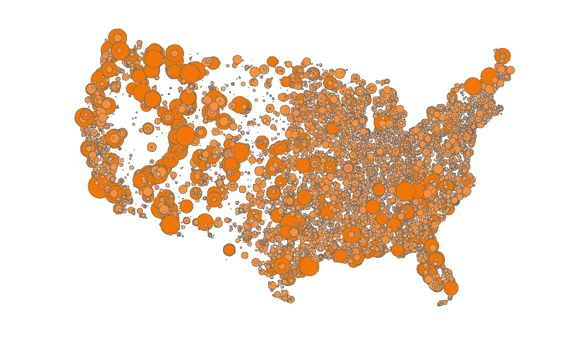
Figure 12: All FM radio signals over the contiguous USA
Colleges and Universities
At this point we have a point shapefile of all US colleges and universities, and a table of graduation and transfer-out statistics for those institutions. We can join these data to correspond each spatial point feature to its statistics.
- Right-click the colleges/universities shapefile in the contents pane. Select Joins and Relates -> Join...
- In the window choose the IPEDS table to join to, and join by IPEDS ID. Indicate that it is an inner join, which means we keep only those rows that are in both tables. This is because we can't do our analysis on a school with no spatial reference, or a school with no retention statistics.
- Hit OK. We now have a shapefile with all the school data we need.
- Export this joined shapefile to its own file in the geodatabase. We no longer need the previous two datasets.
But how do we calculate student cognition or academic ability from this data? One fairly fair way is to consider a high graduation rate as a measure of success, a high drop-out rate as a measure of failure, and a high transfer-out rate as something in-between. Transfer-out students may be performing very well or very badly, there's not enough information to generalize. Of course, this method may seem a bit ignorant, as many students drop out for many reasons, including geniuses, but it seems the most fair method, and less likely to require normalizing for some other spatial attribute. My exact equation was:
This is equivalent to saying graduating is success, transferring out is half-success, and dropping-out (or otherwise not graduating or transferring after 150% of the time it should take) is no success.
- First, we need to cull the rows that have null data from IPEDS. Select By Attribute those rows in the new joined colleges/universities file that have [NumberGraduated] >= 0 AND [NumberTransferedOut] >= 0.
- Invert Select to get all the rows with nulls where we need real numbers.
- Delete those rows. (This removes about half of the colleges but still leaves us with almost 4000 schools, enough for our analysis. Many of the ones removed were minor institutions and beauty schools, which are likely to exist in areas already represented by larger schools with valid data.)
- Create and calculate a new field "SuccessfulRate" in the joined colleges/universities attribute table as SuccessfulRate_(%) = [GraduationRate_(%)] + ( [TransferoutRate_(%)] / 2 )
We know have a quantified measure of academic ability (or cognition) for each spatially referenced college/university. As you can see in the figure below, this data tells us very little so far, except that there are people graduating, transferring out, and dropping out all over the country. Remember that what we are looking for is not a pattern of low to high cognition across the US, but a pattern of strong negative correlation between cognition and number of radio stations in range for each institution.

Figure 13: Colleges/Universities symbolized by "SuccessfulRate", from red (low) to blue (high)
Now let's see both of these layers at once:
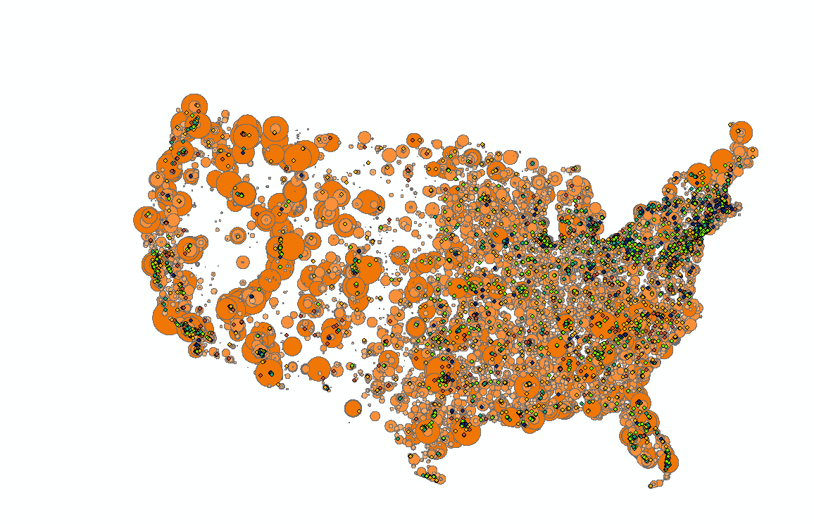
Figure 14: Radio ranges and schools by success
There's not much to see except a general indication of population. But it is not yet clear which spots have the most radio stations, as the buffers overlap each other.
Radio & Colleges/Universities
We are not done processing the FM radio data. We want to know, for a given point (namely a college/university) how many stations are in range. There may be a few ways to figure this out, but I've only found one after a long time searching, dabbling in many different geoprocessing tools.
- Create a new field in your radio buffer feature class. I called it "NumSignals"
- Calculate the Field to be =1 for all rows. Each buffer represents one signal and we're going to sum them eventually.
- Open the Intersect tool.
- For the first input select the Colleges shapefile, and for the second select the buffered FM stations file.
- Leave the other settings as is.
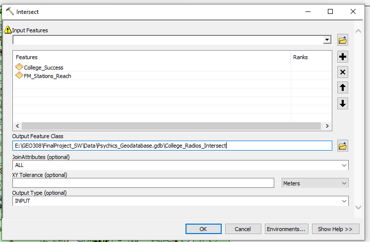
Figure 15: Intersecting FM buffers with college data
You'll see you now have a feature class with ~74000 rows in its attribute table. That is one entry for every intersection of a college and a radio buffer. That means that for every college, there are N rows with that college's data and a radio station's data, and N stations in range of that college. Importantly, each intersect row has an entry of 1 for "NumSignals".
- Open the Dissolve tool.
- We will dissolve the intersected data we just created.
- For Dissolve Fields, select as many from the original colleges data as is sufficient to distinguish one college from another. IPEDS ID will be enough. I also selected the Name field for posterity, SuccessfulRate fields, as we will use it for analysis, and AdjustedCohort, as it can be used to symbolize. The rest of the fields won't be necessary. Do not keep any of the FM radio fields. This tool will take all rows that share common values for your selected fields, and turn them into a single row holding only those fields.
- For Statistics Fields, select NumSignals.
- Beside NumSignals, put SUM as the Statistic Type.
- Hit OK.
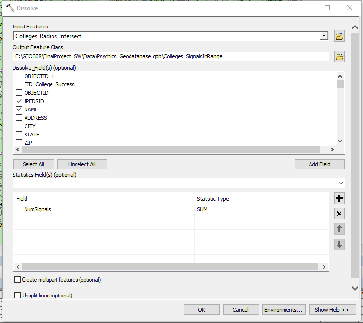
Figure 16: Dissolving the radio/college intersections and summing the number of signals
The resulting dataset has the same number of rows as the earlier colleges data, and a field "SUM_NumSignals" which is the number of signals in range of that college. This is a breakthrough for us ( -for me at least- it took a while to figure out how to get this and none of theideas for similar problems online seemed to work here).
- Let's see what the maximum is for number of signals in range, and what sort of distribution we have. Go to the properties for the new layer.
- Go to Symbology, and choose Quantities.
- Select SUM_NumSignals as the symbolized field. We see the range of values here now. The maximum for me is 95 signals.
- By clicking the Classify... button we can see the distribution of signals in range. There are an appreciable number of colleges in every range of signals.
- Exit the layer properties. You don't have to apply any symbology.
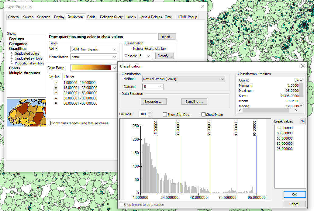
Figure 17: Beautiful range and distribution
What might immediately strike you is that the range of signals in range is approximately 0-100. This makes an analysis on the correlation between this number and the percentage of success field a bit easier. Since each field can be considered a percentage (percentage of successful students, and percentage of possible FM signals in range), we can measure a negative correlation as the difference between the two.
- Create another field in the new Colleges and Signals attribute table. I called it RadioCognitionEffect.
- Make it a float.
- Calculate this field, for all rows, as = abs ( [SuccessfulRate] - [SumNumSignals] ).
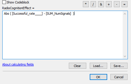
Figure 18: Getting the correlation between number of frequencies in range and academic performance, for each institution
- Now we can symbolize the data. Open the properties of the layer, and go to symbology.
- I selected a quantified symbology, with graduated colours based on the RadioCognitionEffect field. The range of values for this field is neatly distributed across the range of 0 to 98. Success!
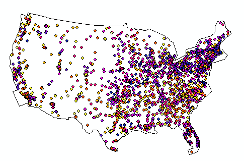
Figure 19: Radio effect on cognition finally mapped
- Let's consider another symbolization. We have multiple fields that make sense to use together. For this symbolization I chose Multiple Attributes, and set the RadioCognitionEffect field to determine the colour from the colour ramp, and the AdjustedCohort field to determine the dot size, so that schools with a higher population are weighted more heavily.
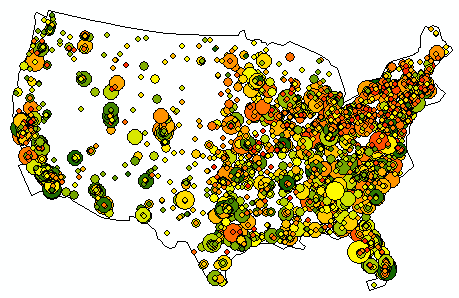
Figure 20: Alternate symbolization. Cohort size determines point size
The next step is the pièce de résistance. It requires raster tools - spatial analysis. We'll make sure we're equipped for it. To define the area over which we will calculate each raster cell, we first need a shapefile of the contiguous USA. I won't get into details, as how you do this is somewhat arbitrary and there are many ways to do it. I created a polygon feature roughly outlining the US, similar to how the I draw ley lines as described further down.
- Make sure raster tools are enable by checking Customize -> Extensions -> Spatial Analyst.
- Set Geoprocessing Environment Settings.
- Analysis Mask is contiguous USA polygon shapefile.
- Open the Point Statistics tool in Spatial Analyst Tools -> Neighborhood -> Point Statistics.
- Select the latest colleges shapefile as the point input.
- Select the RadioCognitionEffect field as the Field of focus.
- I had to play with the cell size and neighborhood size before I got something that made much sense: For some reason a cell size of 1 seemed to result in about 100km cells. I went with: Output Cell Size = .1, Neighborhood = Circle, Radius = 1 Cell Unit.
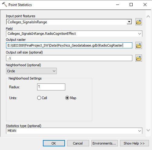
Figure 21: Preparing the Point Statistics tool
The output is a raster feature class, symbolized by the average RadioCognitionEffect in its radius. There are blank spots in the West where no colleges/universities exist for long stretches. I symbolized this raster Blue to Yellow for Low to High effect on cognition.
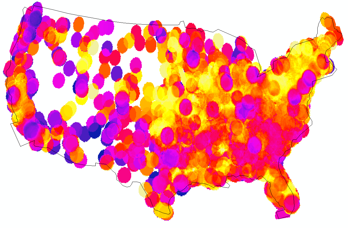
Figure 22: Negative correlation between number of FM frequencies in range and academic performance, rasterized
Vortexes
We will do a similar sequence of steps with this dataset as we did already with the much larger FM radio dataset from the FCC.
- Right-click the vortexes table and select Display X Y Data.
- In the window that appears, select Longitude as X and Latitude as Y.
- According to Esri, Google Maps uses the WGS 1984 geographic coordinate system. Fill in these details and hit OK.
- Now export this new layer as its own shapefile in the geodatabase. We are done with the table we made.
Now we have point features for some major vortexes. You'll notice now, if you hadn't before, that many of them are in the Sedona, Arizona area. It's supposed to be about the most powerful area in the US. We want areas though, not points. The energies are supposed to be present within some radius of the sites, and we need a way to represent higher power at Sedona where the sites are all together. I could try to do something similar to above, trying to find the number of buffers overlapping, but it would be easier to use a partly transparent symbology to see the summing up of energies.
- Add a new field to the vortex data, and set it to 83 for all rows. This is the amount of transparency we need so that it takes six overlapping polygons to reach 100% opacity. We will use this field soon.
- Open the Buffer tool and create a 50km buffer polygon of the vortex.
- Make another buffer, this time 100km.
- Make a 200km buffer.
Ley Lines
We need to georeference the ley lines maps. We will use just the lines that appear in both maps, and position them as close to both references as possible, to create a georeferenced line shapefile.
- Click Add Data, and navigate to the one of the Ley.tiff files.
- Ignore any warnings.
- Click Customize -> Toolbars -> Georeferencing, to open the Georeferencing toolbar.
- Click the Viewer button to open up the ley.tiff you're georeferencing in another window.
- In the new window click the Reposition button to get both frames side by side.
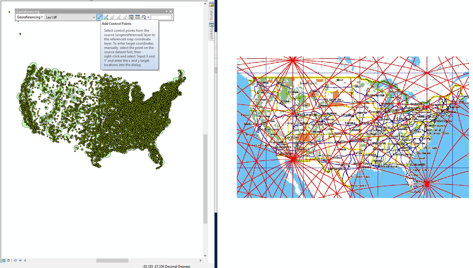
Figure 23: Beginning to georeference a Ley Line map
Now we add control points to each of these images. These points are in pairs, one on each image, and are the points that we assert are in the same location. Because we do not have a basemap, let's select some radio points and colleges in our current map, one at a time, and look online for where they are located in relation to the border of the US. That will give us a more accurate idea of how to place the control points.
- Use the identify tool to click a radio station or college/university near the border/coast to quickly see its address.
- I selected Florida Keys Community College. I see it in my map on the left, and I've found it in Google maps so I can see, more accurately, where it is on the tiff image.
- Click Add Control Points in the Georeferencing toolbar. Click the location of the feature on the image, then on the map. The image may suddenly appear on the map, affixed to that spot.
- Identify another feature and add another control point. Do many of these, until the map lines up (effectively projecting it to our projected coordinate system).
- Once you've made ten control points, click Georeferencing -> Transformation... in the Georeferencing toolbar, and select Spline. This algorithm allows the image to bend.
After making a second control point, the image will become correctly sized, but will still not be projected correctly, so more control points are necessary. It helps to make them at opposite coasts, like one in Florida, one in Washington, one in Maine, one in California, etc. The curve of the lines of latitude can be achieved using points on the Canadian and Mexican borders. Once you've changed the transformation to Spline, you may see a few places where things are still off and need more control points. And don't forget to add a couple control points way inland.
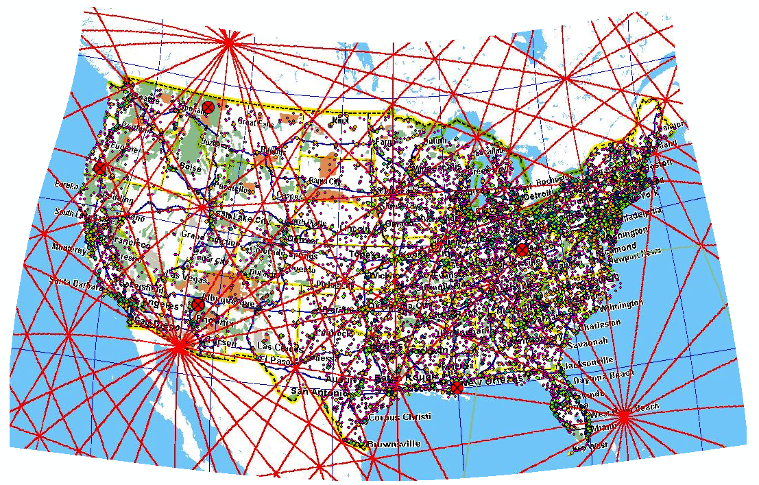
Figure 24: The resulting curvature of using Spline transformation to map to our projection
- Once it looks like its accurately positioned, click Update Georeferencing under Georeferencing in the toolbar.
- You can now exit the second window.
- Click Add Data and navigate to the other of the two tiff files.
- In the Georeferencing toolbar, select this second file. Follow the steps as before to georeference this image. Using the state borders of the first image makes it easier to find control points for the second.
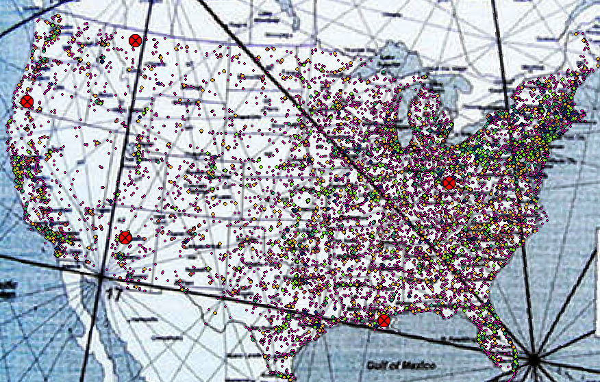
Figure 25: Second tiff georeferenced
Now that both images are georeferenced we can confirm that they mostly agree with each other, but we see that they have little coherence with the vortexes we chose. That's okay. Now is time to create our ley lines line shapefile.
- Right-click your Data folder in the catalog pane, and select New -> Shapefile. Let's call it Leys. Make the type polyline.
- Open the attribute table and add any fields you'll want to keep for the ley lines. Again, I'm making a SiteType field, this time all "Ley".
- Open the Editor toolbar and click Start Editing.
- Choose the new leys shapefile to edit.
- The create features window should open. Make sure leys is selected, as well as Line, under Construction Tools.
- Now you can draw Ley lines vertex by vertex. Double-click to end a line. It doesn't matter how long they are as long as you cover the contiguous US.
- Try to trace both georeferenced images into a single line shapefile. It will take some thought to have the intersections and the lines be loyal to the georeferenced tiffs.
- When you've got plenty of ley lines, Save Edits and close the Editor toolbar.

Figure 26: Display showing the ley lines created using the tiffs as reference
Vortexes & Ley Lines
Now we want to do similar to what we did with the vortexes, and make several buffers from each ley line.
- Again, create a new field in your ley lines data, and give it the same name and value (83) as you gave the field in the vortex dataset.
- Create a 50km buffer from the ley line features.
- Create a 100km buffer, and a 200km buffer.
Now, you should have six buffer energy polygons: Vortex_Buffer50km, Vortex_Buffer100km, Vortex_Buffer200km, Ley_Lines_Buffer50km, Ley_Lines_Buffer100km, Ley_LinesBuffer200km. The names aren't that important. I chose 50km as the base buffer because one of the many sources I had to review to get data on Ley lines, etc., reported that their energies are 100km wide.
- If you want your aggregated energy map to be prettier, you can put each layer through the Clip tool and clip what's outside the contiguous US shape you used for your raster anlysis mask.
- Double-click one of the six layers to open its symbology. Here you can apply advanced symbology.
- Choose a colour for it, then choose Advanced symbology and set Transparency. We will set it to be equal to the field we just made specially for it, 83.
- Now, for the other 5 layers, double-click their names and click import.
- You can import the symbology from the first one you configured, to make each layer equally symbolized.
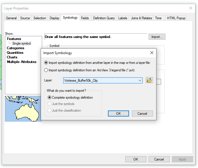
Figure 27: Importing symbology so you only have to configure it once
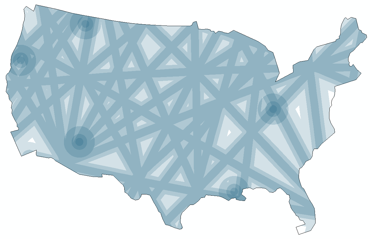
Figure 28: Distribution of Ley and Vortex energies over the US
Conclusion
The resulting map is aggregated spiritual energy achieved without raster tools. The only step left in the analysis is to compare the radio-cognition findings with the vortex-ley findings. There does not seem to be any agreement between the two, overall, that cannot be attributed to coincidence. Of course, I do not believe in superstitious energies, but whether they might have any correlation with the presence of psychics is another question.
The resulting map is aggregated spiritual energy achieved without raster tools. The only step left in the analysis is to compare the radio-cognition findings with the vortex-ley findings. There does not seem to be any agreement between the two, overall, that cannot be attributed to coincidence. Of course, I do not believe in superstitious energies, but whether they might have any correlation with the presence of psychics is another question.
The real purpose of this project was to demonstrate some ArcGIS analysis. I don't hold any beliefs in hiding psychics or ley lines.
See TIF Map/Report Visual
Scott Waechter